Client: BiotaWorlds
Project: Comprehensive Branding & Style Guide
Objective: To establish a cohesive and engaging brand identity for BiotaWorlds, a platform documenting the creation and evolution of unique biotope homes for pet animals.
Client Profile
BiotaWorlds is an innovative platform dedicated to the creation and documentation of unique biotope habitats for a variety of pet animals, including fish, reptiles, and other small creatures. The brand is focused on providing educational content and practical insights to enthusiasts who wish to recreate natural ecosystems within their homes. By showcasing how these habitats evolve over time, BiotaWorlds aims to inspire and educate its audience on the importance of maintaining naturalistic environments for their pets.
Core Values:
- Education: Providing valuable knowledge and insights about biotope creation and maintenance.
- Inspiration: Encouraging pet owners to explore and innovate in their habitat setups.
- Community: Building a supportive and engaged community of biotope enthusiasts.
Branding Needs
BiotaWorlds approached me with the need to develop a comprehensive branding strategy that would encapsulate their vision and values while appealing to their target audience. The primary goals were to create a cohesive brand identity, establish a clear and engaging voice, and design visual elements that reflect the brand’s focus on nature and education.
Key Requirements:
- Unified Brand Identity:
- Create a consistent and recognizable brand presence across all platforms.
- Develop brand attributes that clearly define BiotaWorlds’ unique positioning in the market.
- Engaging Voice and Tone:
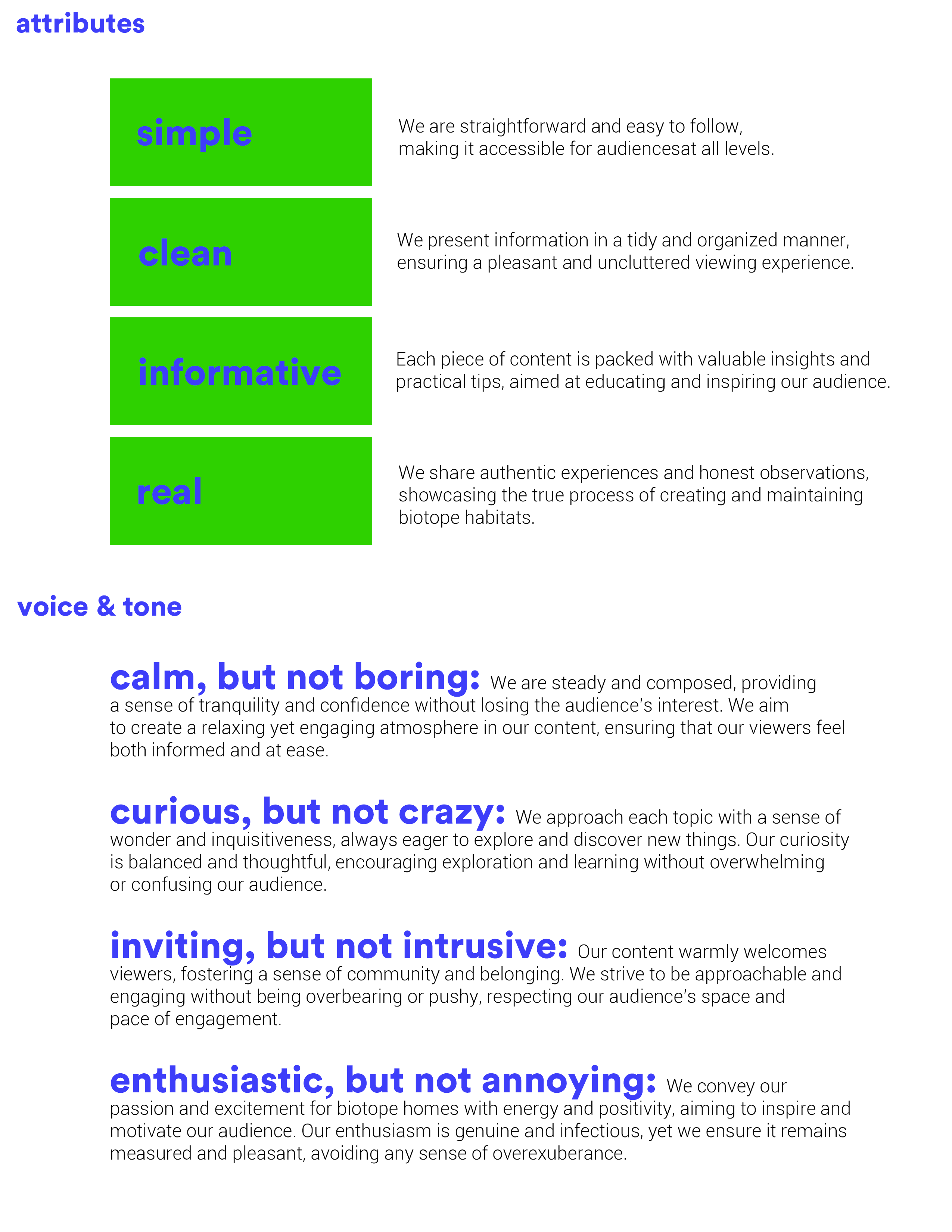
- Establish a voice that is informative, approachable, and genuine.
- Ensure the tone is inviting but not intrusive, enthusiastic but not annoying.
- Modern and Clean Logo Design:
- Design a logo that is simple yet distinctive, easily adaptable across various media.
- Incorporate elements that symbolize the brand’s focus on biotope habitats.
- Harmonious Color Palette:
- Select colors that evoke the natural elements central to the brand’s content.
- Ensure the color scheme is vibrant yet balanced, enhancing visual appeal.
- Clear and Readable Typography:
- Choose fonts that are modern, clean, and aligned with the brand’s attributes.
- Ensure readability and versatility across digital and print formats.
Target Audience:
- Pet owners interested in creating naturalistic habitats.
- Nature enthusiasts who appreciate the aesthetics and functionality of biotopes.
- Educational content seekers looking for reliable and practical information on biotope care.
Conclusion
BiotaWorlds required a brand strategy that not only reflects their dedication to creating and maintaining natural habitats for pets but also engages and educates their audience effectively. By addressing their need for a unified brand identity, engaging voice and tone, modern logo design, harmonious color palette, and clear typography, we aimed to position BiotaWorlds as a trusted and inspiring resource for biotope enthusiasts. The comprehensive style guide we developed ensures consistency and appeal, helping BiotaWorlds stand out in the niche market of biotope creation and maintenance.
Logo Overview
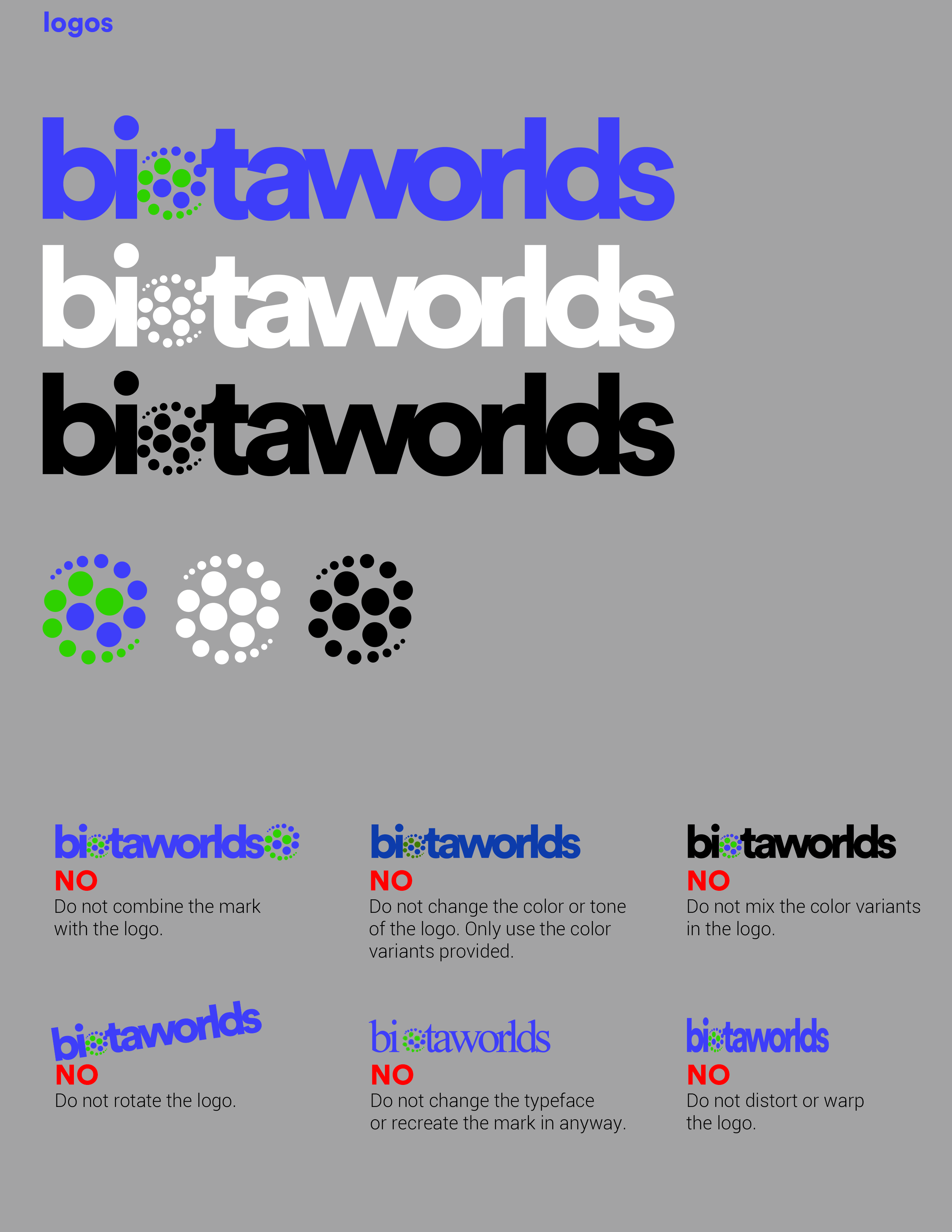
The BiotaWorlds logo is a modern and visually engaging representation of the brand’s commitment to creating unique biotope homes for pet animals. The design effectively combines simplicity, clarity, and an element of dynamism to appeal to the target audience of nature and pet enthusiasts.
Design Elements
-
Typography:
- The logo utilizes a sans-serif font to convey modernity, simplicity, and readability. This choice aligns with the brand attributes of being clean, simple, and informative.
- The font is bold, which ensures visibility and makes the brand name stand out in various applications, whether digital or print.
-
Mark:
- The “O” in the logo is particularly notable for its incorporation of circular elements, symbolizing the interconnectedness of various ecosystems both aquatic and terrestrial. These circles represent molecules, cells, and other natural elements, highlighting the brand’s focus on biology and natural habitats.
-
Color Scheme:
- The primary color used in the logo is a vibrant electric blue (#3E3EF9). This color represents water and aquatic life, evoking feelings of calm, clarity, and trust. It reflects the brand’s emphasis on aquatic biotopes and the serene environments they create.
- Accents of bright green (#2ED100) are used within the circular elements. This color symbolizes nature, growth, and vitality, tying in the terrestrial aspects of biotopes that the brand also focuses on. The green accents create a harmonious contrast with the blue, adding vibrancy and highlighting the natural theme.
-
Visual Dynamics:
- The use of circles in the “O” is not only symbolic but also adds a dynamic quality to the logo. The varying sizes and arrangement of the circles suggest movement and evolution, mirroring the natural development of biotope environments and their relationship to one another.
-
Overall Aesthetic:
- The overall design of the logo is clean and minimalistic, avoiding unnecessary complexity. This aligns with the brand’s attribute of being straightforward and easy to understand.
- The balance of the bold font and the intricate circular elements provides a visually appealing contrast, making the logo memorable and distinctive.
Conceptual Rationale
The BiotaWorlds logo is designed to communicate the brand’s core values and mission at a glance. By combining modern typography with meaningful iconography and a harmonious color palette, the logo effectively captures the essence of BiotaWorlds. It speaks to the brand’s dedication to naturalistic environments, educational content, and the beauty of biotope homes.
The circles of the “O” are a deliberate choice to represent the foundational building blocks of life and ecosystems, reinforcing the brand’s focus on biology and nature. The interplay of blue and green colors symbolizes the balance between aquatic and terrestrial elements, which is central to the biotope concept.
In summary, the BiotaWorlds logo is a thoughtfully crafted representation of the brand, designed to be both visually appealing and deeply meaningful. It serves as a strong visual anchor for the brand’s identity, helping to establish BiotaWorlds as a trusted and inspiring source for biotope enthusiasts.
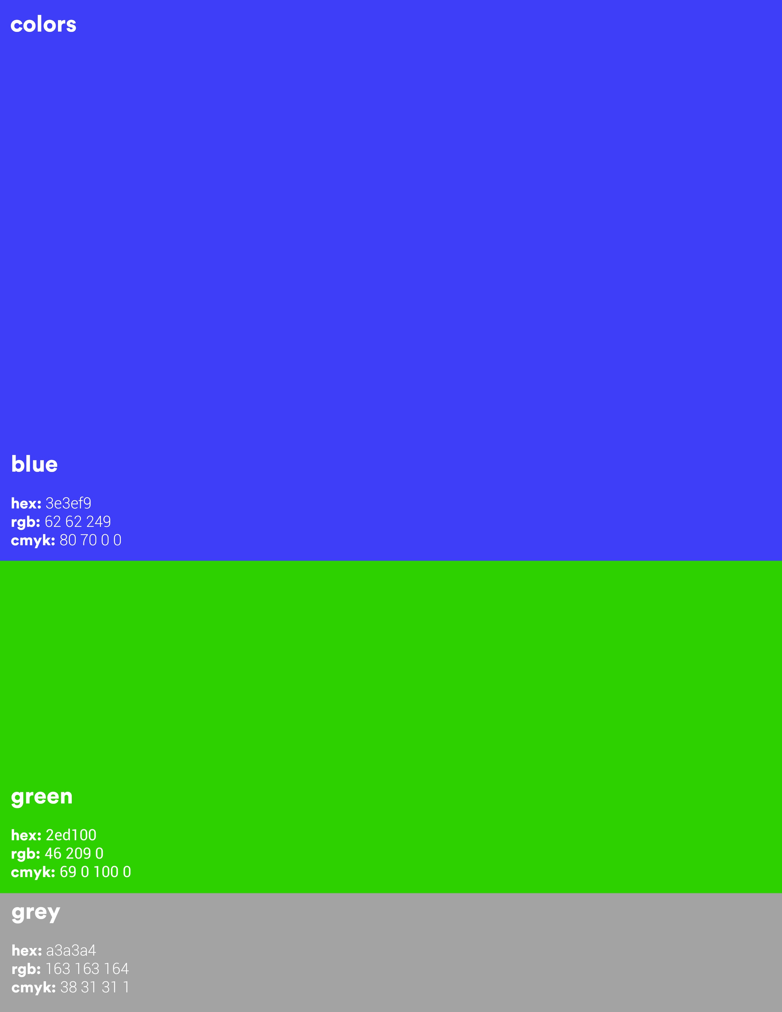
Color Selections
-
Electric Blue (#3E3EF9):
- Symbolism: This vibrant electric blue color represents water and aquatic life, evoking feelings of calm, clarity, and trust.
- Application: Electric blue is used as the primary color in the BiotaWorlds logo and throughout the brand’s visual materials. It signifies the importance of water in many biotope environments, emphasizing the brand’s connection to aquatic ecosystems. The choice of blue also helps to create a serene and reliable atmosphere, aligning with the brand’s calm and informative tone.
-
Vivid Green (#2ED100):
- Symbolism: The bright green color symbolizes nature, growth, and vitality. It evokes the lushness of terrestrial ecosystems and the life-sustaining qualities of plants.
- Application: Vivid green is used as an accent color in the logo, particularly within the circular elements of the “O.” It provides a vibrant contrast to the electric blue, enhancing visual interest and drawing attention to the dynamic aspects of the logo. This color also appears in various graphics and elements across the brand’s visual assets, reinforcing the natural theme and highlighting the growth and vitality central to biotope habitats.
-
Neutral Gray (#A3A3A4):
- Symbolism: This neutral gray color represents balance, stability, and professionalism. It serves as a grounding element within the brand’s color palette.
- Application: Neutral gray is used for secondary text, backgrounds, and other supportive elements in the brand’s visual identity. It provides a subtle and sophisticated backdrop that allows the primary colors to stand out without overwhelming the viewer. This gray also helps to maintain a clean and professional appearance, supporting the brand’s attribute of being real and straightforward.
Color Harmony and Usage
The combination of electric blue, vivid green, and neutral gray creates a harmonious and balanced color palette that reflects the essence of BiotaWorlds. Each color has been carefully chosen to represent different aspects of the brand’s identity and mission:
- Electric Blue: Dominates as the primary color, establishing a connection to aquatic environments and conveying calmness and trust.
- Vivid Green: Acts as a dynamic accent, representing terrestrial life and adding vibrancy to the brand’s visuals.
- Neutral Gray: Provides balance and stability, ensuring the overall design remains clean and professional.
Together, these colors enhance the visual appeal of BiotaWorlds’ brand identity, making it both engaging and meaningful. The thoughtful use of color ensures that the brand stands out while clearly communicating its focus on creating and maintaining naturalistic habitats for pet animals.
Typography Selections
-
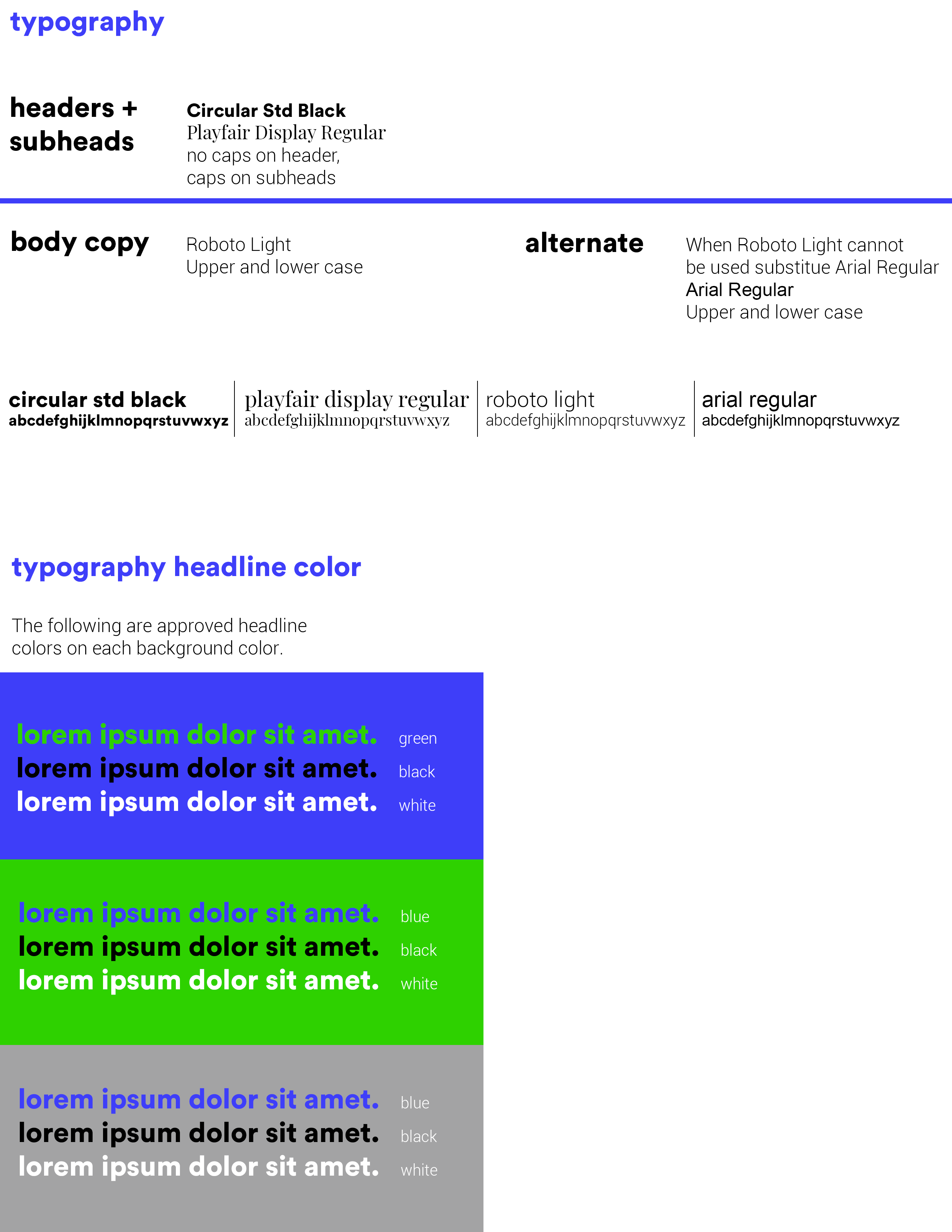
Circular Std Black for Headers (no caps):
- Characteristics: Circular Std Black is a bold, geometric sans-serif typeface known for its modern and clean design.
- Application: Used for headers in lowercase, this typeface gives a contemporary and approachable feel to the brand’s communications. The use of lowercase further enhances the approachable and friendly tone, avoiding the formality often associated with all caps. Circular Std Black ensures that headers are highly visible and impactful, drawing immediate attention to key information.
-
Playfair Display for Subheaders (upper and lowercase):
- Characteristics: Playfair Display is a serif typeface that exudes elegance and sophistication. Its high contrast and delicate curves make it visually distinct.
- Application: Employed for subheaders, Playfair Display adds a touch of refinement and contrast to the overall typography. Using both uppercase and lowercase letters provides flexibility in design and readability. This typeface balances the boldness of Circular Std Black with its own graceful presence, enhancing the visual hierarchy and guiding the reader’s attention effectively.
-
Roboto Light for Body Copy:
- Characteristics: Roboto Light is a clean, modern sans-serif typeface that offers excellent readability, especially in long-form text. Its design features a mechanical skeleton and largely geometric forms with friendly and open curves.
- Application: Chosen for body copy, Roboto Light ensures that text is easy to read and digest, supporting the brand’s attribute of being informative. Its light weight adds a sense of airiness and openness to the text, making content approachable and engaging. This typeface maintains a modern aesthetic, consistent with the brand’s overall visual identity.
-
Arial Regular as an Alternate for Body Copy:
- Characteristics: Arial is a widely used sans-serif typeface known for its clarity and versatility. It is a default font in many systems, ensuring compatibility and accessibility.
- Application: Used as an alternate body copy font, Arial Regular provides a reliable and universally available option when Roboto Light is not feasible. Its straightforward design maintains readability and professionalism, ensuring consistency in the brand’s communication across different platforms and devices.
Typographic Harmony and Usage
The combination of Circular Std Black, Playfair Display, Roboto Light, and Arial Regular creates a harmonious and versatile typographic system that reflects the essence of BiotaWorlds. Each typeface has been carefully selected to serve specific functions within the brand’s visual identity:
- Circular Std Black: Establishes a strong, modern, and approachable presence in headers, ensuring key messages stand out.
- Playfair Display: Adds elegance and contrast in subheaders, enhancing the visual appeal and readability of secondary information.
- Roboto Light: Provides a clean and readable experience for body copy, supporting detailed and informative content.
- Arial Regular: Ensures compatibility and accessibility as an alternate body copy font, maintaining clarity and professionalism.
Together, these typefaces enhance the visual coherence of BiotaWorlds’ brand identity, making it both engaging and functional. The thoughtful use of typography supports the brand’s mission to document and share the creation of unique biotope homes, presenting information in a clear, approachable, and aesthetically pleasing manner.
